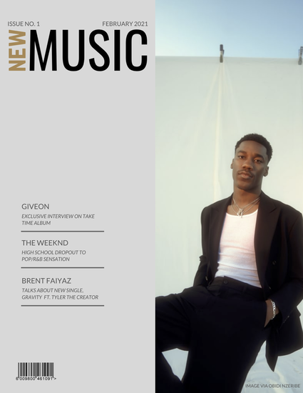
 When I first created my magazine cover, I wasn't sure what I had in mind besides that I wanted it to focus on music. I also didn't know much about the formatting of a magazine cover or how to use photoshop. For my first magazine cover, the image was stretched out, the cover lines were large, and I wasn't content with the overall cover. In my completed cover, the central image is on the right so that the cover lines don't overlap onto the image. It also has the issue number, date, and a barcode whereas my first one didn't. All of the words are located on the left of the cover to keep the minimalistic look, which I was aiming for. I also incorporated photography credits that I didn't do in the first cover. Ultimately, my completed cover fits the aesthetic I was looking for and aims at the demographic that it is targeting. The difference between my first cover and my final cover shows how much my skills have improved.
0 Comments
Leave a Reply. |
Archives
April 2021
Categories |
 RSS Feed
